Possible RBY revamps:
NOTE: These linked mockup images are 1400px wide, though the main content width is 988 (same as CBBY). If your monitor resolution is less than 1400, simply scroll horizontally so the main content is centered. Of course in a working version, there would be no scrolling necessary on monitors with a minimum of 1000px wide, which is standard for laptops/desktops.
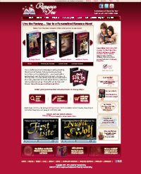
Possible #9: This version changes quite a bit from previous iterations: The page is basically divided into horizontal thirds: 1) header/scroller (which is now the full width of page); 2) explanation text / spotlight of all our different book versions; 3) extra features boxes / customer photo gallery. Note: if you think this third section is too busy, we can move the gallery to one of the scroller panels to clean things up. |
Possible #10: Same as #9 but with red bg.

|
Possible #7: This version is a hybrid of the teen/cbby pages: - moved up the book scroller |
Possible #8: Same as #7 but with red bg. Note one other change from previous red versions: here I've removed the strip separating the header from the rest of the red background. This smoothes out/simplifies the look considerably.
|
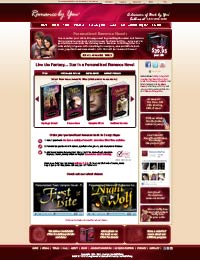
Possible #3: This version adds vertical space, balances out the header fonts and moves the "latest news" text to the sidebar.
|
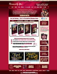
Possible #4: Same as #3 but with red bg
|
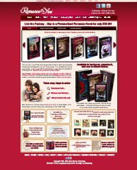
Possible #5: This simplifies the top red section (similar to CBBY) by removing the price/books combo to the sidebar. Also removes the Facebook "like" box and shifts the "Latest News" lower on the sidebar. |
Possible #6: Same as #5 but with red bg |
Possible #3 |
Possible #4 |
Possible #5 |
Possible #6 |
Possible #1 |
This is modelled after the CBBY site, with some features from TBBY (mostly video / Facebook box). The CBBY-esque slider uses slightly smaller cover images due to greater number of books. The main content width is 988px, same as CBBY. Other than the TBBY extras, the only changes to the CBBY layout are 1) the news bulletin section above the books, important since RBY tends to have time-sensitive news items, e.g. Valentine's Day deadlines) and 2) the extra ad banners in the sidebar for gift certs, ebooks, same-sex and teddy bears. Also slightly condensed the "Three steps to ordering" text. Note that if you think there's too much text on this page, we can use the TBBY option of having the "Three steps to ordering" consist of three images, with popups leading to more text. Also, at the top of the page is a thin menu bar that I'd use to unite all the BBY divisions. |
Possible #2 (same layout with light background). |
.